Pages

Tuesday, February 21, 2012

Summer 2011 Air Quality Season Recap (April 1-September 30)

ANNOTATED VISUALS
 Click here to see full-resolution version.
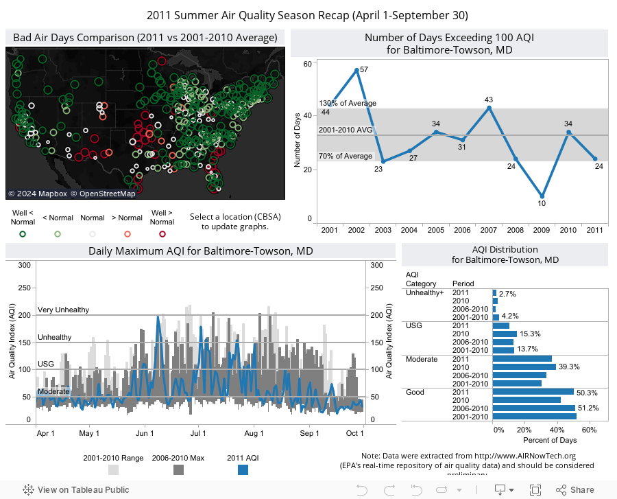
Above figure is a static image of the interactive dashboard prepared for September 2011 Quality of Air Summaries in Baltimore forecasting region. This static version includes annotations under the bottom-left graph whereas the interactive version (shown below under INTERACTIVE VISUALIZATION section) does not. This simple technique can be used to highlight or clarify data in the graph. Details will follow in the DISCUSSION OF VISUALS AND ANALYSIS TECHNIQUE section.

Top-left: Map showing number of bad air days comparisons for 2011 vs 2001-2010 average.
Top-right: Time-series showing number of bad air days during the summer air quality season for selected CBSA from 2001-2011. Gray shaded area show the typical number of bad air days.
Bottom-left: Time-series of daily peak AQI for selected CBSA in 2011 (blue line). Historical AQI are shown as bar charts.
Bottom-right: A sorted bar graph showing air quality distribution by AQI category and year for selected CBSA.

THE STORY
Source: Maryland Department of the Environment's Quality of Air Summaries. (It is copied and pasted directly here.)

Meteorologically and air quality-wise, this summer comprised many interesting highlights. Meteorological highlights will be mentioned with appropriate web resources for further reading. The above dashboard only provides a quick summary of air quality across the U.S. The top map shows a quick comparison of bad air days in 2011 to the 10-year average (2001-2011). By selecting a Core Based Statistical Area (CBSA, e.g. Baltimore-Towson, MD CBSA being selected), other AQI statistics will be updated to provide an instant snapshot of the air quality conditions in that area. Although the discussion is focused on the Mid-Atlantic, a national overview of the data provides additional context. In addition, refer to archived summaries for selected event analyses as well as supporting information for the seasonal recap. The season began with a warmer and wetter than normal weather pattern in much of the Mid-Atlantic (see NCDC precipitation & temperature maps). These weather conditions were somewhat typical in the region for a La NiƱa Spring and were not conducive for ozone formation as well as particle pollution accumulation, and resulted in one of the lowest recorded AQI during April and May in many areas in the Mid-Atlantic. By Memorial Day, a broad area of high pressure system built and persisted across much of the eastern U.S., which allowed hot and humid air to be transported northward into the Mid-Atlantic. This high pressure resulted in the first heat wave of 2011 for the region and caused an extended air quality event (May 30th-Jun 2nd). The 2nd heat wave impacted the Mid-Atlantic and Northeast shortly after the first and resulted in another extended air quality event (Jun 7th-10th). This episode also included the highest daily AQI for Maryland since 2001. Fast forward to July, the Mid- Atlantic and Northeast (and other parts of the Country) continued to observe record breaking temperatures and very dry conditions (below normal precipitation). These conditions lead to a very active month for ground-level ozone in the Mid-Atlantic. From a public health perspective, it was troublesome but from a research perspective it was somewhat “appreciated.” During July, an extensive NASA field study called DISCOVER-AQ took place over Maryland. For the first time, an integrated data set of airborne and surface observations were taken and will be made available to researchers and scientists for analytical studies. Results from these studies will (no doubt) advance the frontier of air quality science for years to come. Once August arrived, the weather pattern changed drastically. Weather patterns transformed from persistent heat to record rainfall/flooding in the Mid-Atlantic and Northeast. Aside from the abundant rainfall and flooding, other highlights included frequent rainy days, a hurricane (Irene in August) and a tropical storm (Lee in September). These weather conditions were the primary reason behind one of the lowest AQI periods ever experienced in many areas in the Mid-Atlantic. A large wildfire called in the Great Dismal Swamp National Wildlife Refuge called Lateral West Fire started on August 4th and fully contained around September 30th. Its impact on air quality in Maryland couldn’t be measured due to lack of PM2.5 monitors in the Eastern Shore (where the impact was thought to be the greatest). Last but not least, a non-air quality related event to remember was a magnitude 5.8 earthquake that shook the East on August 23rd. Amongst the season highlights, it is important to note that air quality in Maryland and much of the eastern U.S. was better than a typical summer using a 10-year average as a comparison (see top-right and bottom-right graphs). The AQI time-series on the bottom-left also provides a daily comparison between 2011 vs historical 5- year and 10-year data. This time-series confirms and provides a visual inspection of the AQI trend, which once again showed mostly improving air quality conditions.

INTERACTIVE VISUALIZATION

Use the interactive dashboard below to explore the data and come up with a story in your area. Reload the page if it appears to be blank.

DISCUSSION OF VISUALS AND ANALYSIS TECHNIQUE


Imagine you are a concerned or curious citizen who really wants to learn more about the air quality conditions where you live, what questions you would ask? A few possible questions are highlighted below:
  • Q1: What was the overall air quality in my region and how does it compare to other areas? 
  • Q2: How many bad air days were observed and how did that compared to previous year? 
  • Q3: What is the air quality trend?
  • Q4: What were some of the highlights for the season?
It is important to note that the listed questions likely wouldn't answer everyone's questions; however, they should be sufficient to convey a general description of air quality conditions in a particular area. The main challenge to me was how to best communicate the answers to those questions with the least amount of space. To be exact, my requirement was one-page and it should contain sufficient visuals and discussion to convey an air quality recap for the season. Historically, I designed my visuals using Excel and Powerpoint. However, they were very limited in functionality and interaction and primitive in visual design. I had to applied numerous tricks (learn from various sources on the web) to design visuals that meet the requirements outlined by Stephen Few in his book "Show Me the Numbers: Designing Tables and Graphs to Enlighten." During the past two years, I have been using Tableau software to design my visuals and I highly recommend this to anyone who had not tried it yet.

Before diving deep into the discussion of visuals, I want to acknowledge that 2001-2011 data across the U.S. were extracted from http://www.airnowtech.org/, EPA's real-time repository of air quality data and should be considered preliminary. In addition, I define April 1-September 30 to be the summer air quality season. This is true for the Mid-Atlantic but it would be different in other areas. Lastly, it's important to note that raw data (non-aggregated) should be extracted from AIRNowTech and then processed manually to ensure consistent statistics. To the best of my knowledge (and I could be wrong), old sites in this system were likely not assigned to a CBSA. Thus, extracting data by CBSA may yield in-consistent statistics over time. For data analysts who follow this blog, you can mash raw
AIRNowTech data to a text listing of CBSA on the U.S. Census Bureau by merging FIPS code (combination of 2-digit state code and 3-digit county code) to the first 5 digits of site ID / AQS Code.
 
Going back to the discussion of visuals, the map on the top-left panel of the dashboard provided an overview air quality across the United States. In this map, the number of bad air days (days exceeding 100 AQI) in 2011 was compared to the 10-year average (2001-2010) to get a sense of "normal." Most importantly, the qualitative state (normal, below and above normal) for each area presented on the map was explicitly declared. This technique was also used in first post of the blog (July 2011 Record Heat and Its Impact on Air Quality). For visitors who had not read the first post on the blog, the technique is elaborated below: 

  • Defined 2001-2011 average as “normal” and computed percent change between 2011 vs 2001-2010 (i.e. departure from normal). 
  • Defined the qualitative state of 2011. I defined normal as percent change within ± 30% of normal; Incremental values between 30-60% above/below 10-year average would be considered "above/below normal." Likewise, values below -60% and above 60% would be considered "well below normal" and "well above normal", respectively.
Using the map, users can select a CBSA and all other graphs will update on-the-fly to provide additional details. This type of interaction is standard in Tableau. The first graph I want to mention is the time-series graph showing the number of days exceeding 100 AQI. In this graph, the area within ± 30% about the 2001-2010 average was shaded to explicitly show normal condition. Anything above/below the shaded area would be considered above/below normal. This technique is consistent with the classification scheme on the map. Thus far, both visuals (map and time-series of bad air days) could partially answer the first 3 out of 4 questions noted above.

The next visual shown in the bottom-right (i.e. AQI distribution chart) would help answer the first 3 questions in their entirety. Traditionally, this type of data is presented using pie chart. However, it is less effective for communicating quantitative information by making it harder for readers to decode information as compared to a bar chart. Refer to Stephen Few’s Visual Business Intelligence Newsletter titled “Save the Pies for Dessert” for further reading. I must confess, I am a convert myself. Below are fictitious AQI data presented as a pie chart for demonstration.

  • Let's try to determine which color represents the largest slice? Green, Yellow or Orange? Is it hard to accomplish such a simple task? Even if you think know the answer, you are not 100% confident. This is exactly what should be avoided when it comes to designing visual to communicate data. 
  • Now, let's mouse-over the pie chart to see their labels. Notice that we are now relying on the labels or essentially an equivalent of a data table to determine their values. If you got it right, give yourself a tap on the back. For the rest of us (including me), we have to recognize our limitation to judge angle in this type of display.
If the same data are plotted using a simple horizontal bar chart, none of us would have any trouble determining their relative values. That's because we can visually compare the length of each bar with or without labels and/or legend (see Bar Chart 1 and 2 below). Note that the standard AQI colors are still applied to each bar to keep them consistent with the slices in the pie chart. However, this is not necessary. A better designed bar chart for this data is provided on the far right (see Bar Chart 3 below). This version is clean and easy to read because non-essential elements are removed, including gridlines, color legend and AQI colors.
Now we are ready to design bar charts to display the AQI distribution data. The following display show 2 plausible options, each with its own strength, which means they should be used under different scenarios. Option 1 is best for showing part-to-whole relationships (i.e. comparison of AQI category in each period). Option 2, on the other hand, works better for showing trend (comparison of AQI category across periods). Thus, Option 2 was chosen for publication in the dashboard.
Some of us may be thinking about the use of a time-series to present these data. However, it is not logical to create a time-series graph since the periods are not the same. Edward Tufte introduces Slopegraphs as a way to compare changes over time and it could be applied to the AQI distribution data. However, if we choose to use this type of display, we must modify the periods a bit to make it presentable for a slopegraph. For instance, we could use three periods: 2001-2005, 2006-2010 and 2011. A slopegraph for Maryland data is provided below. By the way, I would have used this display in the dashboard instead of a bar chart if Tableau supports it. However, it does not at the moment. For readers who are interested in creating this graph, you can google "Tufte comparison chart" to find resources on how to create slopegraphs.
Thus far, we have discussed three visuals in the dashboard. The last visual is a time-series graph of daily peak AQI (blue line). Overlaid on the background includes bar charts showing historical 5-year and 10-year maximum AQI. These data along with the daily peak AQI allow us to observe general pattern, outliers as well as trend. This graph may appears overwhelming initially; however, getting used to it can offer much insight into the data. After all, the graph is designed to provide a detailed history of the summer air quality in its entirety. I would consider this graph a "cross-over" between visual designed for analysis vs communication. This leads to the next point that I want to bring up for discussion - Annotation.

Annotation is defined as "a critical or explanatory note or body of notes added to a text" by dictionary.reference.com. Applying this concept to visuals/charts is no different. The act of annotating is not hard since we only have to write text and create special drawings (e.g. circle, lines, etc.) to engage readers and communicate the data more clearly. However, the process of making annotations is difficult because it requires "critical" and "analytical" research about the data as well as a good understanding of the story hidden in the data. I strongly urge all my colleagues in the air quality community to apply this technique in your visuals. My approach to using annotations is simple "if something in the visuals deserve to be highlighted to help readers understand the materials, then it ought to be annotated."

In the above time-series graph of daily peak AQI, annotations are used as a way to narrate the air quality story in Maryland throughout the summer air quality season. Important highlights during the season (i.e. answers to the last questions) are noted in the graph to provide readers with context, comparison as well as additional information via hyperlinks. Tableau software supports a variety of ways to annotate data points as well as region of the graph or map. This is a very powerful feature since annotations are directly linked to the items that they describe. However, these annotations lack the ability to use hyperlinks. In the interactive dashboard, I chose not to use the annotation feature in Tableau because the annotations used only apply to the Mid-Atlantic region. In addition, I also wanted readers to be able to use hyperlinks to navigate to additional information which is currently not supported. Instead, annotations with hyperlinks are marked directly on the Quality of Air Summaries.


SHORT TAKE-HOME MESSAGE

I hope the demonstrations in this post can play a role in stimulating us to start thinking about designing visuals differently. Remember there are multiple ways of presenting the same information. Knowing the strength as well as weaknesses in each method can help us design more effective visuals for communicating air quality information. If you are interested in showing air quality trend or AQI distribution data (part-to-whole relationships), use a bar chart and/or slopegraph instead of a pie chart. If you are interested in highlighting or clarifying data or information in a graph, use annotations.
What are your thoughts in regards to the visuals? Please participate in the discussion to help promote thoughtful presentation of air quality information. This is a learning process.

DISCLAIMER: Any statements, postings, shares, likes, follows on the blog should be considered personal. They do not represent any political or official endorsement from my employer.

Sunday, January 29, 2012

August 2011: A Month to Remember - Not for Air Quality but for Abundant Rainfall, Flooding, a Hurricane and a rare Earthquake!


VISUALIZATION

Note: Graphic was prepared for August 2011 Quality of Air Summaries. Click here to see full-resolution version.
Top-left: Deviation from normal precipitation for August 2011 in inches.
Top-right: 24-hour rainfall total ending at 8 AM EDT August 28, 2011 in inches. Precipitation data is overlaid on Terra MODIS Visible Satellite imagery on August 27, 2011 along with Hurricane Irene's track.
Bottom-left: Map showing the number of rainy days for a typical August using long-term NCDC Comparative Climate Data. Small inset map for August 2011 is provided as a comparison to long-term data.
Bottom-right: Annotated upper-level pressure anomaly for August 2011 showing a persistent area of an upper-level trough of low pressure over New England.

THE STORY

Source: Maryland Department of the Environment (MDE)'s Quality of Air Summaries. (It is copied and pasted directly here.)

Record breaking temperatures for this summer ended during the first week of August in the Mid-Atlantic and Northeast. However, other weather conditions took center stage for the remainder of the month. August 2011 will be remembered for abundant rainfall, flooding, a hurricane and even a rare earthquake that originated near central Virginia (not shown in maps) on the 23rd. Not to mention a wildfire burning throughout the month in the Great Dismal Swamp (Lateral West Fire), south of Suffolk, VA also threatened the air quality in parts of the region. The fire caused reduced visibility, a strong smoke odor and possibly very elevated particle pollution levels (i.e. health concerns) in the Delmarva Peninsula. However, it was not possible to determine the fire’s pollutant impact due to lack of PM monitors in those areas. Going back to other meteorological conditions, precipitation data from the NWS Advanced Hydrologic Prediction Service (AHPS) shows above normal rainfall over the Northeast and parts of the Mid-Atlantic. In fact, some localized areas observed 18-25 inches above normal rainfall when compared to a typical August. Much of the rainfall fell on the 27th-28th due to the influence of Hurricane Irene. In the top right panel is the estimated 24-hour rainfall ending at 8AM EDT on August 28, 2011 overlaid on a visible satellite imagery along with Hurricane Irene’s track. Irene caused record rainfall and flooding in many cities in New England (NCDC). Needless to say, these weather conditions brought generally Good air quality across the region during the last week of August. However, the effect of Hurricane Irene was not sufficient to result in one of the lowest monthly median AQI [Air Quality Index] being recorded in many areas across the region, including all four forecast regions in Maryland. The low daily median AQI was driven by a persistent upper-level trough of low pressure located over New England (bottom right map by NCDC). This was associated with a jet-stream that directed storms into the region frequently and caused more days with unsettled weather conditions. It was clearly evident in the number of rainy days (days with 0.01" or more precipitation, also referred to as measurable rainfall) over the same region. Based on the long-term average, most of the Eastern U.S. usually experiences about 9-10 rainy days during the month of August (bottom left map). The exceptions are located along the Southeast Coast and mountainous areas over the Northeast Appalachians where precipitation is enhanced due to topographic (orographic) lifting. During August, due to the presence of the jet-stream and the upper-level trough of low pressure, many areas in New England observed as many as 18 rainy days. When compared to the long term average (bottom left map) the result was roughly one additional week of rain and non-conducive weather for ozone formation in August. This combined with the continuous decline in pollutant emissions resulted in many areas in the region recording one of their lowest monthly median AQI.

DISCUSSION OF VISUALS AND ANALYSIS TECHNIQUE

It is important to re-state the fact that many natural "disasters" took center stage during August 2011. These occurrences (abundant rainfall, flooding, and more frequent rainy days) were meteorologically driven and directly resulted in improved air quality conditions across the Maryland and New England as a whole. This air quality trend in Maryland is provided in the MDE's Quality of Air Summaries for four forecast regions using a time-series of daily maximum AQI presented in the form of a simple box-plot (low-median-high). For readers in other areas in the New England, you can view air quality maps from EPA AIRNow for a quick inspection. These maps highlighted areas observing Moderate (Code Yellow) AQI or higher. For areas with no shading indicated Good air quality conditions. There were only several bad air days (shaded Orange for Unhealthy for Sensitive Groups). From these maps, it is fair to conclude that air quality was mostly Good and Moderate in New England during August 2011.

Since air quality was not very "interesting" for August 2011, the goal was to highlight the meteorological conditions (i.e. abundant rainfall, flooding and more frequent rainy days). I typically start an analysis with a top-down approach (examine the big picture and then drill down to the details as needed). For this reason, I typically start out by searching for weather highlights. The National Climatic Data Center (NCDC) State of the Climate page is a good place to start. Other resources such as weather providers and newspapers are available sooner than NCDC products. For this reason they can sometimes be more useful. For this edition, residing in the East as well as visiting the NCDC State of the Climate for August 2011 provided me with an excellent summary. I identified flooding, excess precipitation and Hurricane Irene to be important factors. This led to the top two figures highlighted in the VISUALIZATION section.
  • The NWS Advanced Hydrologic Prediction Service (AHPS) is an excellent resource that provides archived precipitation data. August 2011 monthly departure from normal precipitation map is provided directly on this blog for discussion.
    • This map quickly highlights the
      Northeast and parts of the Mid-Atlantic as area of interest for observing excess precipitation. Note that this observation is biased since the air quality story is for Maryland and the Mid-Atlantic. If you live in other parts of the county, the deficit precipitation over most of the country should be more interesting.
      • The color scale was designed fairly well to highlight areas of deficit/excess precipitation with "hot/cool" colors. However, it's important to note that it can be improved using one of the recommended diverging color schemes on the ColorBrewer2.org website by Cynthia Brewer, et al.
    • For publication purpose, I decided not to use the map for two reasons: (a) high-resolution version is not available; and (b) color scheme doesn't match with the template designed for the MDE's Quality of Air Summaries. As a result, data were extracted from the NWS AHPS  website and plotted using ArcMap with Spatial Analyst extension.
      • The color scale follows a generic hot/cool color scheme to denote deficit and excess. Note that the NASA Blue Marble background image is provided as a visual attraction but un-intentionally it somewhat competes with the data (shades of blue to denote excess precipitation over the New England). This should be avoided if possible.
The next step was to investigate areas of excess precipitation (i.e. New England). According to NCDC State of the Climate for August 2011, Hurricane Irene made landfall near Cape Lookout, North Carolina on August 27th, and tracked north along the Eastern Seaboard through August 29th. Hurricane Irene brought record rainfall and caused flooding in many cities in the East. This was enough clue to suggest that the excess precipitation was likely caused by Hurricane Irene. For this, I began to drill down into daily precipitation map on the NWS AHPS website.
  • The 24-hour precipitation ending 8AM EDT August 28, 2011 proves that the excess rainfall is caused by Hurricane Irene. Note that data is provided based on a hydrologic day not a calendar day. The map is once again provided for discussion.
    • Pros: Reveals spatial pattern quickly with relative magnitude.
    • Cons: Gives a false impression to areas with warm colors (orange, red, pink are much more intense in comparison to yellow. Shaded color relief map to show topography in background sometimes compete with data. In addition, contour intervals are not the same at low levels. As a meteorologist, I suspect that it is intentionally designed to highlight areas with drizzle, light/heavy rain, etc.
    • This map can be improved with the following: (a) shaded relief map with subdued colors such that they won't compete with data; (b) use a discrete color ramp with increasing intensity, also known as sequential color schemes on the ColorBrewer2.org website. Four versions of this precipitation map are genenerated to back up my recommendation. In all four versions, it is easy for us to quickly describe the spatial pattern of the data. HOWEVER, there is only version that allows us to describe the intensity quantitatively between each color hue EVEN without a color legend and the associated contour intervals.


For publication purpose, the map on the right is used. The note that the contour interval was intentionally broken into 4 categories for areas observing below 2 inches. The purpose was to highlight areas trace amount of precipitation, drizzle, light/moderate rain intensity. Additional data layers were also overlaid to provide supporting information. In the background, a true-color imagery from Terra satellite showed the beautiful cloud structure and areas impacted by Hurricane Irene on the morning of August 27, 2011 (courtessy of UW MODIS Today website). In addition, Hurricane Irene's track (from Hurricane and Storm Tracking website) provided a partial history of its impact over New England.

Going back to the air quality story, the precipitation maps discussed thus far only show that New England was impacted by Hurricane Irene during the last week of August 2011. Needless to say, weather conditions associated with Hurricane Irene brought generally Good air quality across the region during the same period. However, its effect was not sufficient to result in mostly Good to Moderate air quality conditions across the region (refer to air quality maps from EPA AIRNow for a quick inspection). To answer this question, I visited the NCDC National Temperature and Precipitation Maps website for a quick look. A 500 Millibar Heights and Anomalies map is also featured on this page at the bottom of the selection list. I personally think the map was designed exceptionally well (color scheme, contour interval and how elements in the map do not compete with one another). For this reason, I decided to use the map for publication. I only had to annotate the map with a couple of features (trough line and a jet-stream) to help non-technical readers understand the map better. The map indicated a persistent upper-level trough of low pressure located over New England. This was associated with a jet-stream that directed storms into the region frequently and caused more days with unsettled weather conditions. This map helped fill a big gap in the air quality story to help anwer why air quality in the region was mostly Good to Moderate.

At this point, I only needed to find data to prove that there were more frequent rainy days to relate them back to the jet-stream and a persistent trought line. For this Comparative Climate Data from NCDC were downloaded, matched with a master surface station list (NCDC Surface Inventories) and plotted. This was not a fun task! Perhaps, if there is interest, I can provide a help document at a later time. The comparative climate data was used to create a contour map showing the number of rainy days for a typical August (based on long-term average). The main goal is to examine large spatial patterns, not any specific details. Based on the contour map, it's clear that most of the Eastern U.S. usually experiences about 9-10 rainy days during the month of August. The exceptions are located along the Southeast Coast and mountainous areas over the Northeast Appalachians where precipitation is enhanced due to topographic (orographic) lifting.

The remaining task was to compare August 2011 data to the long term average. Due to the nature of the data, I had to manually obtain the number of rainy days (.01+ inches) for selected stations over the Mid-Atlantic and Northeast using preliminary monthly climate data (CF6) from the local NWS offices. Note that I only obtained selected station data and were not complete as compared to the long term average data set. For this reason, it was logical for to create a point map instead of a countour map. By the way, this was also the reason why I couldn't create a departure from normal map similar to others shown above. The point map showing the number of rainy days during August 2011 is provided as a insert map on the bottom-right corner of the contour map. Using the discrete color scheme alone, it was clear to conclude that many areas in New England observed as many as 18 rainy days. When compared to the long term average (contour map) the result was roughly one additional week of rain and non-conducive weather for ozone formation in August. This observation helped explain the reason why air quality in New England was mostly Good to Moderate during August 2011. This made the air quality story complete.
I hope that the discussion of the visuals used to communicate this particular air quality was sufficient.  I hope that it provides enough meaningful comparisons to show how abundant rainfall, flooding and requent rainy days resulted in mostly Good to Moderate air quality conditions in New England.

SHORT TAKE-HOME MESSAGE

In this edition, the main element used to communicate this particular air quality story was map and I repeatedly emphasize the use of color schemes. I personally think creating a readable and usable map to convey the message spatially is not difficult but will take practice. If you are new to this and you are asking for tips. Well I recommend Stephen Few’s Visual Business Intelligence Newsletter titled “Cartographic Malpractice” for further reading. Knowing what to avoid doesn't create good "cartographers" but will reduce our chance of making another horrible map!!!
What are your thoughts in regards to the visuals?  Please participate in the discussion to help promote thoughtful presentation of air quality information. This is a learning process.


DISCLAIMER: Any statements, postings, shares, likes, follows on the blog should be considered personal. They do not represent any political or official endorsement from my employer.